Modern Pastel Colors In Interior Design
Collect full set of guidelines to design your home – for free
What are pastel colors and how are these used in interior designing?
- Pastel colors are simply brighter shades of well-known colors that have been mixed with white. They can be characterized by calmness and neutrality. Pastel colors are pale variations of primary colors and exhibit lightness and low saturation. To create a pastel shade, blend white into the original color, mixing the pigments until they fully combine. The more white you add to the original color, the lighter the pastel shade becomes.
As tints of primary colors, pastel hues are not on a traditional color wheel. Their limited saturation and pale shades create a soothing and romantic atmosphere. The most popular pastel colors used in home interiors are pink and blue. But it’s only one of the possibilities. Pastel color palette also includes:
- warm grey,
- sand,
- creme,
- canary yellow,
- salmon pink,
- dove-grey,
- bright green,
- mint green.
Why pastel colors are one of the best option for your interior spaces?
Pastel colors help in creating calm and soothing interior designs is very popular in large cities, whose residents experience constant stress and fatigue. In such a design, an individual approach to the project is important, which must be carefully thought out, created without haste, in harmony with nature and oneself. Pastel colors create a soothing atmosphere and do not strain eyesight and psyche. An interior in pastel colors does not get boring even after several years. Pastel colors have many advantages:
- Due to their softness, you can use them in large quantity, as they do not irritate the eye.
- Pastels are refreshing. These shades belong to the spring palette and evoke a feeling of lightness and airiness.
- Pastel shades create an atmosphere of calmness, lightness and sophistication.
- Pastels in the interior visually increase the space and the amount of daylight. This quality is useful for small rooms on the north side of the house.
Learn how we at ‘Prayogshala Manifesto‘ use pastel colors in different spaces –
Collect full set of guidelines to design your home – for free
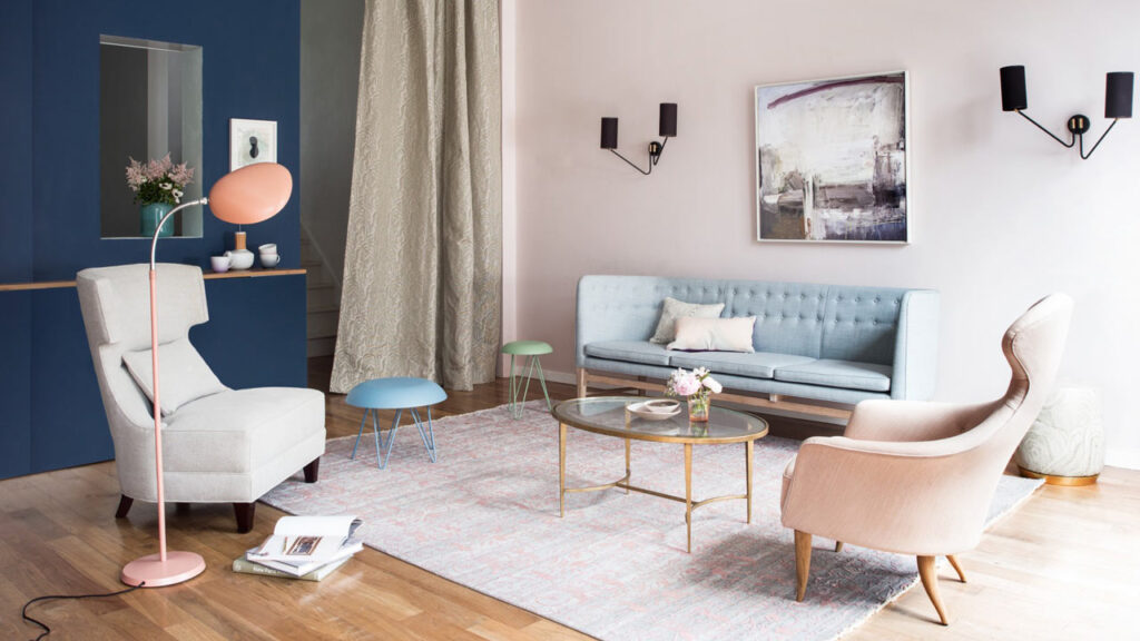
When choosing pastel colors for your interior you need to be careful and avoid a nursery room or a candy store look. To obtain the lightest and most delicate interior, the most successful combination will be with neutral shades such as white and light gray. Both colors harmoniously combine with almost the entire color palette and in combination with pastel tones form a romantic and relaxing interior design. Warm pastel colors are usually used in rooms facing the north side. Peach, sand, yellow-orange, beige-brown shades are recommended for such areas. Light ultramarine, turquoise, blue, pearl, shades of gray are considered to be on the cold side of the spectrum. These tones are good for large rooms on the south side of the house. For example, a trendy mint shade in accessories, furniture upholstery, curtains is in harmony with ivory walls
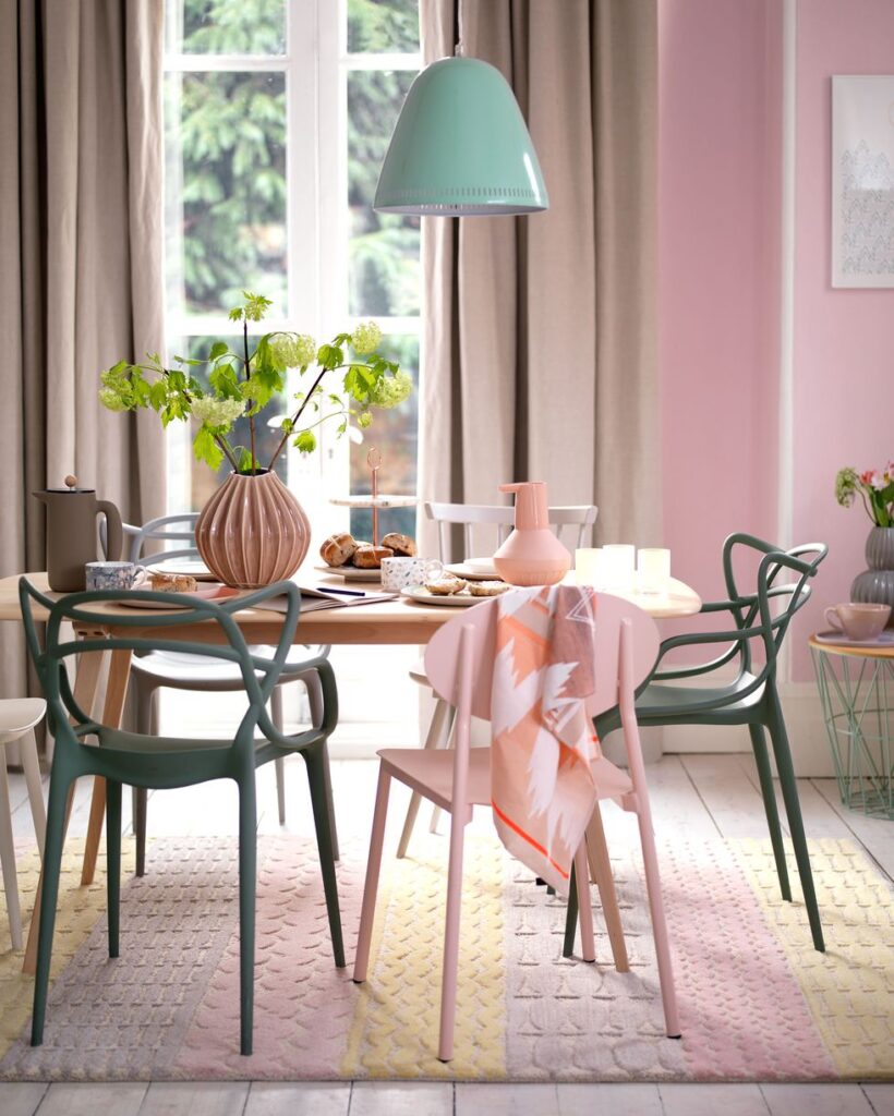
Pastel colors are perfect choice for a main color and go well with traditional and modern design style and materials. To add more variety and character to the pastel shades, it is worth adding geometric shapes, interesting prints and shapes, unique accents.
Pastel color combinations
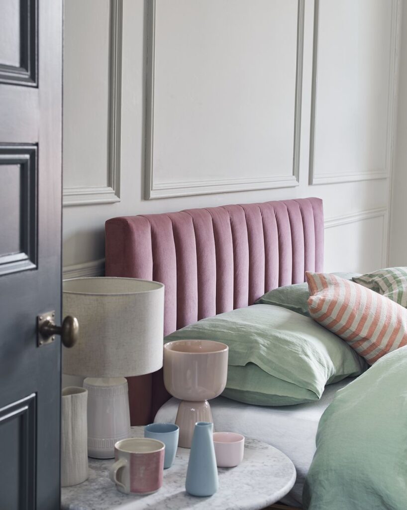
- Monochromatic decor is based on one color of different saturation, from white pastels to deep shades.
- Complimentary colors are opposite shades on the color wheel, such as pale pink and blue. In the design of the apartment, this combination looks brighter and more interesting. Despite the opposite colors, the room will not be overloaded due to the soft shades.
- Analogous colors are the adjacent shades and will be a continuation of each other in the interior of the room. The shades are close to each other, but are not variations of the same color.
Collect full set of guidelines to design your home – for free
Need help?
We have simplified the understanding and use of pastel colors in interior spaces which can be used for simple jobs.
See how Prayogshala Manifesto can help you with pastel colors in designing complex spaces with a large number of elements like residential apartments, restaurants, commercial offices, landscapes and other complex interior spaces.
Connect with us for guidance or consultation –