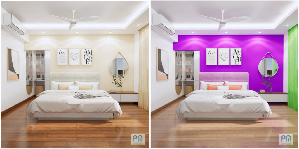
Why the image on left looks better? Know how color combination affects.
Collect full set of guidelines to design your home – for free
VIBGYOR
VIBGYOR stands for Violet, Indigo, Blue, Green, Yellow, Orange and Red. These 7 colors combine to make white light visible to human eye. VIBGYOR itself is a systematic arrangement of colors in which all adjacent colors have a combination which naturally looks good. Our vision is synthesized to feel good when we see this arrangement. Different color combinations evoke different moods or tones by using color theory and color psychology. When it comes to artificially combine colors, we have to blend it as per the natural variations happening in flowers, plants, insects, geography etc. Based on research and observations there are a few types of color combinations which are noticed and explained below.
Types of color combinations
1. Monochromatic
Monochromatic color schemes use a single color with varying shades and tints to produce a consistent look and feel. Although it lacks color contrast, it often ends up looking very clean and polished. It also allows you to easily change the darkness and lightness of your colors.
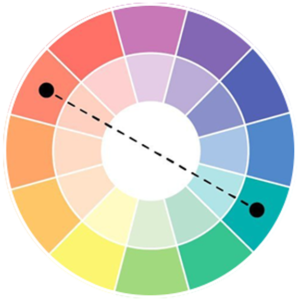
2. Complementary color combinations
Complementary color combinations are colors that sit opposite each other on the color circle. Complementary colors provide feels of energy and vitality to the viewer.
3. Triadic color combinations
A triadic color combination is a combination that uses three colors. They are equidistant on the color circle, making the shape of a triangle. Using this type of color combination can create feelings of peace and harmony for the viewer of your design.
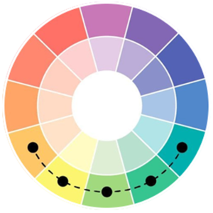
4. Analogous color combinations
An analogous color combination is a combination of 2 to 5 colors that sit adjacent to each other on the color circle. It creates a smooth and pacifying feeling for the viewer and designers often opt to choose muted hues within these combinations.
Learn how we at ‘Prayogshala Manifesto‘ use color combinations in different spaces
Collect full set of guidelines to design your home – for free
There are three primary methods that we use when we design a house, office, interior spaces and exterior spaces as well which are basic to understand and easy to implement.
1. Complementary color combination
2. Triadic color combination

3. Analogous color combination
Use of 60-30-10 Rule
The 60-30-10 divides a color scheme into percentages of color use.
60% Main Color
The main color should represent 60% of color used in your room design. This typically includes the wall color, floor color , and a furniture. It may also include the window treatment, such as curtains or draperies. All of these don’t necessarily need to be solid colors, but the main color should always be prominent.
30% Secondary Color
The secondary color will represent 30% of your décor color scheme. With only half the amount of color saturation as the main color, the secondary color doesn’t compete for attention in your overall design. Instead, it should contrast with the main color. Being a different color, the secondary color creates depth and interest in your décor.
10% Accent Color
The next color will be one-third of the secondary color and one-sixth of the main color. This color is designated as the accent color. Its purpose is to give greater interest and contrast to your color scheme. It should be used throughout the décor to draw the eye deeper into the room design.
Collect full set of guidelines to design your home – for free
Need help?
We have simplified the understanding of color combinations which can be used for simple jobs.
See how Prayogshala Manifesto can help you with colors in designing complex spaces with a large number of elements like residential apartments, restaurants, commercial offices, landscapes and other complex interior spaces.
Connect with us for guidance or consultation –